The new design overhaul of LinkedIn is the biggest in the site's history
Importance: (For B2B marketers)
Recommended source: LinkedIn blog
LinkedIn have just launched the largest desktop redesign since the site was first built back in 2003. They've re-designed the whole experience from the ground up, at the same time as re-designing their mobile app. The idea is to build a site that is more intuitive, simpler and faster to use. The new layout is currently rolling out across the world and should soon be live for all users - we are seeing it for some our team, on which this review is based, but not others.
Some of the most important changes for those using LinkedIn for marketing include:
- Changes to the LinkedIn feed, tweaking the algorithm to get better at showing quality content users are interested in. They've also mentioned they'll be using humans as well as algorithms to select the most relevant content - this could cut down on spam and make it easier to reach your audience, if the content quality is right. LinkedIn is certainly spam rich, so this is overdue.
- A universal search box which lets you apply filters to find more specific results. This is neat, but of course, you still have to pay to filter for the business criteria that really matter.
- Greater insights into who is viewing your content - including job titles, companies and locations of those engaging with your updates.
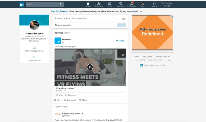
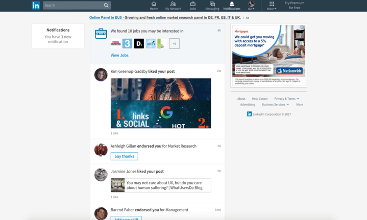
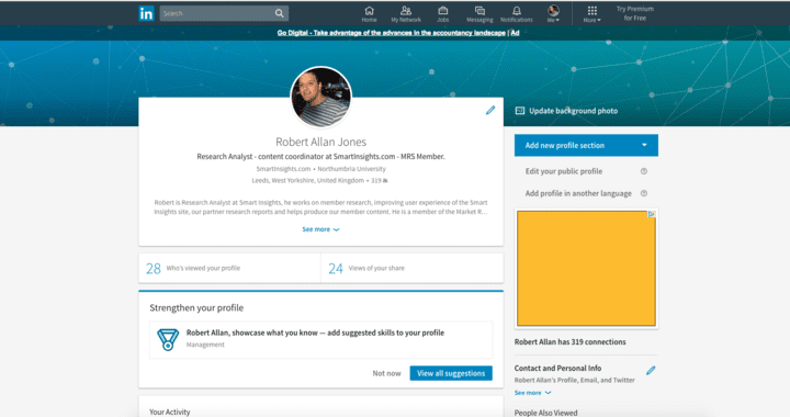
The new sleeker look might also encourage more people to visit LinkedIn regularly, which is good news if you are currently using the platform to promote your business. If the changes haven't been made it to you yet, then you can see the new design below.
New home page:
New profile page:
If you want greater insights into the new design, you can view this video from LinkedIn showcasing the design.
source http://www.smartinsights.com/social-media-marketing/linkedin-marketing/linkedin-redesign-simplifies-site-puts-focus-content-smartinsights-alert/


No comments:
Post a Comment