How and Why We Have Updated the UX in Our Members' Area
With over 150,000 active Basic, Individual and Business members accessing our resources through our members' area when they are signed in, we take the user experience (UX) of this area extremely seriously.
Since we first launched the members' area in Smart Insights in November 2011 we have updated its look and feel several times through major changes to the features and tests to improve usability and conversion. The new UX, launched this week is one of the biggest changes in look-and-feel for two years. So, in this article I wanted to detail what the changes are and why we made them. I won't explain how different types of resources can help businesses in different use-cases or scenarios, these are detailed in our Getting Started guide for members. Before I get to the 5 new features I'll also explain a little about our processes and tools for measuring and improving customer satisfaction since the techniques we use may be useful for using on readers own sites.
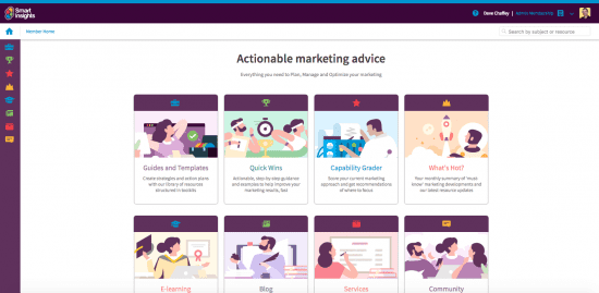
The most obvious sign of the new UX members will see is user home where a list of our 20 toolkits is replaced by different formats for learning. Within each area content is then categorised in toolkits.
New Members' Home
How we track and action customer satisfaction feedback
Feedback from members has been the main driver for this change. We use many techniques and channels to get feedback and in all of these we have had regular prompts from members suggesting a need to improve the usability of the members' area. The main feedback channels we use are:
- Contextual surveys automatically served to new members after several weeks by email marketing automation.
- Annual surveys which feature Net Promoter Score asking whether members' would recommend our service.
- Hotjar user feedback tool - serving contextual feedback in the members area on specific pages like our toolkit pages.
- Customer feedback via contact us forms which we manage through Helpscout (this is the largest volume feedback accounting for over 100 questions or comments each month).
- A monthly / quarterly review process to categorise and report on the member feedback collected through the different methods above. Changes are then prioritised and put into our Basecamp system for managing changes to UX and site features.
So, you can see that we have quite a few ways of getting feedback and through implementing the review process it was clear that the vast majority of feedback was about frustrations with the UX rather than about the content.
Feedback on our member content is generally, really positive and doesn't identify many gaps in resources, instead it's generally about minor errors or suggesting that our detailed guides and templates are really helpful, but shorter summaries would be useful too. In response to this feedback we recently launched our Quick Wins format of actionable learning and templates focusing on one activity to boost leads and sales such as creating a multichannel marketing plan, on-page SEO, Welcome Emails and Facebook retargeting.
So, which feedback prompted this change? Essentially, the issue was a findability issue stemming from a previous initiative intended to make our content easier for members to find and apply! Around two years ago we introduced the concept of toolkits to group content related to one activity such as developing a strategy or boosting results through a channel like SEO, social media or email marketing.
This toolkit-based approach has been successful front-of-site since by offering clear areas of focus, more members have joined us since they like this grouping compared to other sources without clear structure. The main problem was that after finding a resource members wanted to work on the previous UX required them to find the resource again within a grouping of the toolkit requiring multiple clicks. Although we update our content regularly, with two new or updated pieces of content every week, it also often wasn't consistently clear when the content was last updated.
The new features
The changes you will see are in these main areas:
- 1. New member home page for accessing different types of content and tools. As shown at the start of this article, this helps members access the type of recommendations and learning they need, for example guides and templates (the most popular), quick wins (for focused learning on one topic), e-learning, capability graders (to score business approach through time to get better results) and What's Hot which is a one-page summary of the most important changes in digital marketing in the last month.
The ideas of this change was to surface some features such as e-learning, graders and what's hot more prominently since they were lost in the design of the toolkits.
These types of content and tools are also accessible at any point in the members area by the icons in the left navigation.
- 2. New people-based visual design. We have been using this design for the past 8 to 12 months in some areas of the site, like the home page and Quick Wins and the 'human touch' has tested well, so we have rolled it out to give clear context of which type of learning the member is accessing.
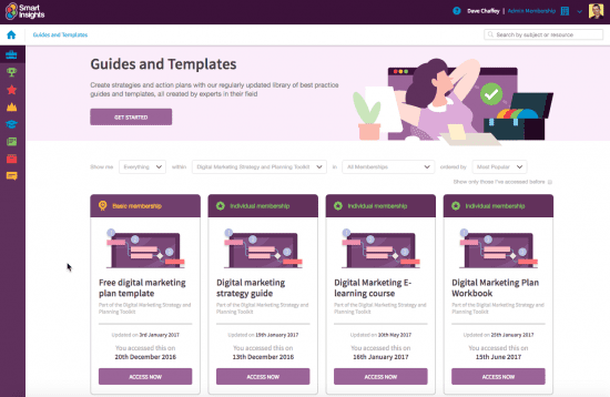
- 3. New library page for downloadable resources. Since our guides and templates are our most popular type of content we have a single library page to browse all resources or select those in each toolkit, for the topic you are working on, e.g. Digital Transformation. It will also make it easier to filter which content is available by member level: Basic (Free), Individual or Business.
Guides and templates tools
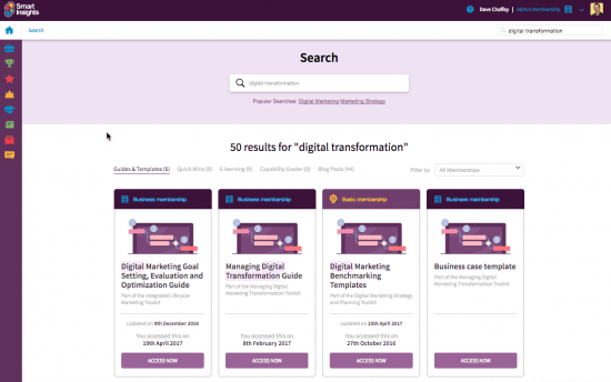
- 4. New, rapid content search features. As a WordPress site, we were previously limited by WordPress search functionality and database query latency. We are now using the Algolia custom search engine to serve content in the member's area immediately since it's cached. Hopefully you will find it a much more rapid experience, with results being delivered 'instantly'. This features in most of the areas, but you will notice it most in the Guides and Templates library page and a new custom search replacing Google Custom search engine:
New search results
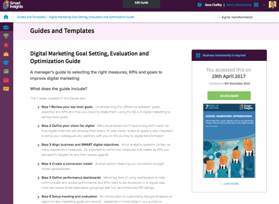
- 5. New 'one-click access' to download a resource. This addresses the frustration of multiple clicks to download a resource. Each resource has a clear 'Sticky' panel which stays in place as you scroll and features date accessed, updated and the all important big green button to get an instant download:
New resource page showing one-click access and update history
So, as I said at the start of the article, it's a big change, which has taken nearly 6 months of specification and development. We have tested the changes thoroughly, but we're sure there will be some minor bugs or tweaks to usability, so do let us know about how you find it, plus any suggestions or bugs through our Contact Us or any of the other channels above.
source http://www.smartinsights.com/user-experience/whats-new-upgraded-members-area-guide-5-main-new-features/


No comments:
Post a Comment